
BoxOffice: Movie Ticketing App
BoxOffice is a mobile app that allows users to book tickets for their favorite movies at the theater location and showtime of their choice.
Background
Role
Solo UX researcher and designer
Responsibilities
User research, competitive audit, paper and digital wireframing, low and high fidelity prototyping, usability testings
Design Tool
Figma
Project Duration
January 2022 to February 2022
This project was done as a part of Google UX Design Professional Certificate program offered through Coursera.
Project Overview
The Problem
Conventional ticket booking method is impractical for people who can’t or won’t spare time to go to the box office and wait in line. Some features in existing ticketing apps are troublesome for users and aren’t practical enough.
The Goal
My goal in this project is to design a mobile app that allows users to book tickets for their favorite movies at the theater location and showtime of their choice in an easy and practical way.
Design Framework
The design framework mainly used as a basic guideline for this project is the Design Thinking framework.
Empathize
-
User research
-
Competitive audit
Define
-
Personas
-
Problem statements
-
User journey maps
Ideate
-
How Might We (HMW)?
Prototype
-
Paper wireframes
-
Digital wireframes
-
Lo-fi prototype
-
Mockups
-
Hi-fi prototype
Test
-
Usability tests and user interviews
User Research
I conducted initial user interviews to gather insights from potential users regarding their experience in using ticketing apps. The interviews were done in written form in order to save time and cost. The primary user group was undergraduate students who visited the theater at least once a month in average and are familiar with mobile movie ticketing apps. The purpose of the interviews was to collect qualitative and quantitative data, where it mainly covered preferences, likes/dislikes, frustrations, and suggestions regarding the existing ticketing apps and conventional booking method.
I was under the assumption that of all the respondents, there would be a few people that prefer the conventional ticket booking method (directly to the theater box office). It turned out that only 1 respondent prefer the conventional method, and the rest prefer using online method (ticketing website/app).
Pain Points
Out of all the responses from the initial user research questionnaire, a few themes are obtained to be defined as pain points as a description of what problems people generally face in using the existing ticketing apps.
Pain Points
Human Error
Some users are prone to making unconscious mistakes that leads to mistaken bookings, and are unable to get a refund from the theater company.
Pain Points
Payment Methods
Existing apps have a fixed option of payment method, which is not always convenient for all users who don’t use certain payment methods and prefer others.
Pain Points
Define Locations
Existing ticketing apps requires users to input city name before selecting theater location. It’s troublesome to keep track of cities where theaters are located, especially in areas of intersection among multiple cities.
Pain Points
Visual Design
Some aspects of the existing apps designs aren’t intuitive and visually appealing enough to be able to be used quickly.
User Persona
I created a user persona as a single representation of all the people who participated in my initial user research. I gathered information which were common among all the respondents as well as a mix of distinct ones and synthesized a general point of view.
![Google UX Design Certificate - Persona [Movie ticketing app].png](https://static.wixstatic.com/media/57d092_be56e05da8a14f87a0b8a1e1be4d0a92~mv2.png/v1/fill/w_652,h_366,al_c,q_85,usm_0.66_1.00_0.01,enc_avif,quality_auto/Google%20UX%20Design%20Certificate%20-%20Persona%20%5BMovie%20ticketing%20app%5D.png)
Problem Statement
"Joy is a junior researcher who needs to reserve tickets at the movies for her and her friends/family because she wants the best seats for the best experience to enjoy her limited leisure time."
User Journey Map
I tried to put myself in the shoes of a user and imagine what it's like to order movie tickets with a conventional method, which is directly at the theater box office. In a user journey map, I included descriptions of the tasks a user has to do to accomplish the goal and how they feel during the process. The journey depicts more clearly the pain points experienced by a user. I included some ideas to improve the user's journey in ordering movie tickets, which would be incorporated in the app design.
![Google UX Design Certificate - User Journey Map [Movie ticketing].png](https://static.wixstatic.com/media/57d092_b1dddd1bb8d14b6aa2f17854092648fa~mv2.png/v1/fill/w_643,h_362,al_c,q_85,usm_0.66_1.00_0.01,enc_avif,quality_auto/Google%20UX%20Design%20Certificate%20-%20User%20Journey%20Map%20%5BMovie%20ticketing%5D.png)
Competitive Audit
A competitive audit was conducted to compare essential and additional features that contribute to user convenience and ease in ticket booking process among different ticketing applications. The key competitors included in this analysis are TIX ID and Go-Tix as direct competitors, as well as XXI M-Tix and CGV as indirect competitors. The classification of direct and indirect competitors was based on the number of theater brands included in the apps.
A comprehensive comparison was done among the existing apps regarding their features, flow, navigation, accessibility, visual aspects, and content. Positive remarks were considered to be incorporated into the app design, and negative remarks were to be avoided or improved.
How Might We (HMW)?
How might we make a way for people to book tickets without going to the theater box office?
How might we reduce the possibilities of human errors in the booking process?
How might we make the ticket booking process less complicated?
How might we help people find movie titles and theater locations more easily?
How might we make the payment process more convenient
User Flow
Similar to the making of a user journey map, I visualized the process a user goes through when using the ticketing app I was going to design. The main goal here is to purchase movie tickets in advance using a mobile app.
As seen on the diagram below, users can browse movies in two ways: by movie title or by theater location. After selecting a movie and a designated theater location, the user proceeds to pick their seats and complete their payment.

Storyboards
Similar to the making of a user journey map, I visualized the process a user goes through when using the ticketing app I was going to design. The main goal here is to purchase movie tickets in advance using a mobile app.
Big Picture Storyboard

Close-up Storyboard

Paper Wireframes
Using a pencil and a sketchbook, I sketched drafts of how the mobile ticketing app would look like. I created a few different versions of each page in order to gather every possible layout. In the end, I picked out the elements I liked from each frame and created a finalized wireframe.

Digital Wireframes
I transferred the previously created paper wireframes into a digital format using the design tool Figma. I mostly created the designs based on the paper version, but I also made some changes on a few frames in order to improve them.
On the "Movies list" page, I arranged a three-by-three grid list of movies so that one screen could fit a lot of movie posters above the fold and so that it's easier for users to scan through.
On the "Theater list" page, I included sort and filter features so that users can easily look up certain theater locations. Users can sort by theater name or distance from their current location. I also included a filter for theater brands and city where the theater is located.
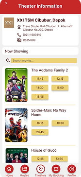
I created two types of showtime list pages where users can view and select movie schedules: (1) by theater location, and (2) by movie title. I arranged all the schedules in a grid for every theater location and movie so that it's easier for users to compare and take into consideration when choosing which movie to watch.
On the "Seat selection" page, I created a full-view of the seating plan and a smaller zoomed-in-view of a smaller area of seats so that it's more convenient to pick seats.
I included a variety of payment options to accommodate users with various preferences of payment methods.
Homepage
Movies list
Showtime by theater
Theater list
Showtime by movie

Movie description
Seat selection
Booking summary
Payment
Confirmation

Usability Study
I conducted two usability studies: (1) using low-fidelity prototype (derived from digital wireframes), and (2) using high-fidelity prototype (an improved version of the low-fidelity prototype). Both studies required participants to follow prompts which include tasks they need to accomplish by navigation though the app prototype. I asked the participants for feedback regarding various aspects of the app after each task was completed.
The first study is more in-depth, since the designed used is still low-fidelity, and I received a significantly higher amount of feedbacks from participants compared to the second study. Feedbacks from the usability studies are organized into sticky notes in an affinity diagram, which later was used to define insights and create solutions for design iterations. An example of an affinity diagram from the low-fidelity usability study can be seen below.
Affinity Diagram
All of the feedbacks in the form of quotes, recommendations, questions, and statements obtained from participants of the usability studies were grouped by similarity to create themes. These groups of themes were used to create insights as a guide to decide what design changes should be made in order to fulfill users needs.

Design Iterations
Changes in the wireframes design, which was used as the basis of the low-fidelity prototype, were made based on insights which were gathered from feedbacks gained from the previously done usability study. Those changes were implemented in the more improved version of the wireframes, which are mockups. The changes are mostly about the layout, button placement, and also addition and revision of features. In the mockups, the design is transformed into a newer and more finalized version, where colors, typography, and iconography were used. A couple of design iteration examples can be seen below.
In the low-fidelity prototype, users had to input the number of seats at the top part of the screen before selecting seats to book. Participants of the usability study found it troublesome to do so and thought that it’s unnecessary.
In the high-fidelity prototype, the previously required “Number of seats” field is removed, and a new “Total number of seats” field is added at the bottom part of the screen which is automatically filled by the system when users select seats to book.
In the low-fidelity prototype, the bottom navigation bar only contains Home, Movies, Theaters, and My booking icons. The Profile icon is placed separately, at the top right part of the screen. Participants of the usability study thought that it’s not visually appealing and impractical to have the icon isolated from the others.
In the high-fidelity prototype, I moved the profile icon to the bottom navigation bar so that all five icons are placed next to each other in one place.
Before Usability Study

After Usability Study

Before Usability Study

After Usability Study
Final Prototype
After conducting a second usability study using the improved design, which is the high-fidelity prototype, and received more feedbacks from users, I added a few minor changes on the design and created a finalized version of the prototype. In this revision stage, I mostly made changes regarding the spacing between elements, wording, and color selection.


Style Guide

Final Thoughts
Takeaways
01
Impact
Participants of the usability studies admit that they would like to use this app in real life if it’s implemented. It would really be beneficial and effective for users in booking movie tickets.
02
What I learned
I gained a lot of new perspectives from user studies and usability studies, especially form the first usability study using the low-fidelity prototype. After the second usability study using high fidelity prototype, I received more positive feedback and less things to iterate on my design.
Next Steps
Color Accessibility
Some colors hasn’t passed the AA test on the WebAIM contrast checker, so the color palette selection needs to be reconsidered in order to meet the accessibility requirements.
Screen Reader Compatibility
The design hasn’t been made screen reader compatible, so it needs to be developed further.
Other Prioritized Insights
Incorporate the P2 priority insight into the design (miscellaneous features gathered from the previous usability studies).
That's a wrap!
Thank you for your time and attention upon reviewing this case study, I really appreciate it. Please feel free to reach out and get in touch with me. I hope you have a great day!