Kuro-Kuro Online Ordering Responsive Website
Kuro-Kuro is a street food stand in Bandung. Kuro-Kuro website and app allows customers to input their order, pay in advance, and pick up their order at the stand when it’s ready.
Background
Kuro-Kuro is a street food from Bandung, Indonesia that mainly focuses on Kuro-Kuro Bread, where customers can freely customize toppings.
In this project, I created a design for a system that allows customers to input their order, pay in advance, and pick up their order at the stand when it’s ready. I created two versions of the design: a desktop website and a responsive mobile web app. I made sure that both versions contain all essential elements and convey the same impression I intend to deliver to users.
This project was done as a part of Google UX Design Professional Certificate program offered through Coursera.
Role
Solo UX researcher and designer
Responsibilities
User research, competitive audit, paper and digital wireframing, low and high fidelity prototyping, usability testings
Design Tool
Figma, Adobe XD
Project Duration
March 2022
User Research
I conducted an initial user research where the participants are people who are familiar with street food stands, including former university students who have visited Kuro-Kuro stand before the pandemic, all between the ages of 10 to 60.
The research questions were about participants' experiences ordering Kuro-Kuro, difficulties they faced, likes and dislikes, and things they wish could be improved from the product and ordering process. Before the research, I was under the assumption that all participants would have various problems or frustrations regarding the conventional ordering system. It turns out that most of them have a similar problem, which is related to the queueing time.
Pain points
Out of all the responses from the initial user research questionnaire, a few themes are obtained to be defined as pain points as a description of what problems people generally face in ordering at the Kuro-Kuro stand.
Pain Points
Pain Points
Waiting time
Very long queue time is inconvenient during busy hours.
Pain Points
Pain Points
Order input
It’s hard for participants to input their order especially when there’s a lot of customers.
Pain Points
Pain Points
Unorganized queue
A large crowd of customers tend to gather around the stand creating a sense of chaos.
Pain Points
Pain Points
Item unavailability
Participants were disappointed when they learned that certain items were unavailable just when they reached the stand.
User Persona
I created a user persona as a single representation of all the people who participated in my initial user research. I gathered information which were common among all the respondents as well as a mix of distinct ones and synthesized a general point of view.
![1.2. Google UX Design Certificate - Persona [Template+kuro].png](https://static.wixstatic.com/media/57d092_b20a486edb4749d19fa1146066cddb73~mv2.png/v1/fill/w_608,h_336,al_c,q_85,usm_0.66_1.00_0.01,enc_avif,quality_auto/1_2_%20Google%20UX%20Design%20Certificate%20-%20Persona%20%5BTemplate%2Bkuro%5D.png)
User Journey Map
I tried to put myself in the shoes of a user and imagine what it's like to order a Kuro-Kuro bread from the stand. In a user journey map, I included descriptions of the tasks a user has to do to accomplish the goal and how they feel during the process. The journey depicts more clearly the pain points experienced by a user. I included some ideas to improve the user's journey in ordering from Kuro-Kuro, which would be incorporated in the website and mobile app design.
![1.3. Google UX Design Certificate - User Journey Map [Template+Kuro2].png](https://static.wixstatic.com/media/57d092_8fe528950bb14eb7abceb79f97243091~mv2.png/v1/fill/w_644,h_366,al_c,q_85,usm_0.66_1.00_0.01,enc_avif,quality_auto/1_3_%20Google%20UX%20Design%20Certificate%20-%20User%20Journey%20Map%20%5BTemplate%2BKuro2%5D.png)
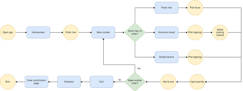
User Flow
Below is the user flow to complete the main task that is attempted to be completed using the Kuro-Kuro website, which is creating an order. I visualized the process a user goes through when ordering at Kuro-Kuro, but this time the journey is about using the online ordering website and mobile app I was going to design.
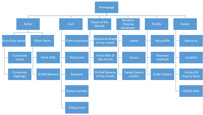
Sitemap
This is a sitemap which mainly describes the information architecture of the contents in the Kuro-Kuro website. It contains information about the pages categories and subcategories as well as its contents. By creating this sitemap, I could plan and organize the website content better and in a more structured manner.
Paper Wireframes
Using a pencil and a sketchbook, I sketched drafts of how the mobile ticketing app would look like. I created a few different versions of each page in order to gather every possible layout. In the end, I picked out the elements I liked from each frame, marked using little stars next to it. After analyzing each frame draft and considering which elements I wanted to use, I created a finalized wireframe which included all the starred elements combined.
.png)
Digital Wireframes
Desktop website
I transferred the previously created paper wireframes into a digital format using the design tool Figma. I mostly created the designs based on the paper version, but I also made some changes on a few frames in order to improve them.
I decided to design all the page contents above the fold so that users don't need to scroll down and avoid mistakes from any missed information if contents were placed below the fold.
Kuro-Kuro has three main items on their menu: Kuro-Kuro bread, fresh milk, and grilled bananas. In this wireframe, I only focused on the Kuro-Kuro bread menu. There are plenty of toppings to select from, so I needed to figure out a way to create an efficient layout to showcase all of them.
I included images for the menu items and customizations to create a better visualization of what users are selecting. I also included a concise order summary containing item name, quantity, and price on the "Checkout" page so that users can review their order one last time before completing their payment and inputting their order to the seller.
In the last page, which is the "Order confirmation", users receiver three new information: their queue number, time estimation, and pick-up time, which would help the pickup process become more organized and efficient. Users can come to the stand at the designated time and avoid waiting in long lines, and pick up their order by showing their queue number to avoid order mix-ups.

Mobile app
The mobile app version is essentially the same with the desktop website version, but packed into a smaller layout of a mobile phone screen. I made sure that all the elements fit on every page and all essential texts are readable with the right font size.
In the desktop website version, most of the contents are placed in a two-column layout which was arranged horizontally (side by side) because the screen has a landscape orientation. Since it's impossible to create in the mobile screen size, I laid the content into a top-and-bottom layout because mobile phones are usually used in a portrait orientation.
I converted the footer contents into a side hamburger menu to save space, and also because the information there is not directly related to the main ordering process.

Usability Study
I conducted a usability study using the low-fidelity prototype I created based on the digital wireframes. In the study, participants were required to complete the task of creating an order using both the desktop website and mobile app versions. I observed the participants' navigation throughout the website and app.
Upon the task completion, I asked the participants about the difficulties or confusion they might have experienced. I also asked about the aspects of the design they liked and dislike, also if there's anything they would like to be changed.
All feedbacks from the usability study were organized into sticky notes in an affinity diagram, which later was used to define insights and create solutions for the next design iterations.
Affinity Diagram
I grouped all of the feedbacks in the form of quotes, recommendations, questions, and statements obtained from participants of the usability studies by similarity to create themes. These groups of themes were used to create insights as a guide to decide what design changes should be made in order to fulfill users needs.

Design Iterations
Changes in the low-fidelity prototype design are made based on insights gathered from feedbacks gained from the previously done usability study. Those changes were implemented in the more improved version of the wireframes, which are mockups. I incorporated colors, typography, and iconography. I also included images for the menu items. I polished the designs by adding rounded corners and shadows for some elements.
Some changes regarding the elements and features were also made for a few pages. On the "Menu" page, for example, a search bar was added so that users can look up certain toppings more easily. A note feature was also added to enable users to send a message regarding additional requests upon the order.
Menu Page Before Usability Study

Menu Page After Usability Study

Final Designs
After incorporating design changes on the wireframes based on feedbacks I received from the usability study participants, I finished polishing the mockups and added interactions on all the pages to create a high-fidelity prototype. I mainly focused on the desktop website version, and only created mockups for the mobile app version.
Desktop website mockup

Mobile app mockup

Style Guide

Final Thoughts
Takeaways
01
Impact
Kuro-Kuro is a small street food stand, yet it has touched a large number of people’s lives, especially students who frequently visit the campus area. According to participants of the usability studies, designing this website and mobile app would create a big impact to lots of people who loves Kuro-Kuro and would bring much improvement and efficiency to their productive days.
02
What I learned
Designing 2 versions of websites is harder than it looks. It’s more than just about scaling down components and screen sizes, but also about thinking how the layout would be visually, intuitive, and easily navigated. It’s pretty hard to fill a big desktop screen, but it’s also hard to arrange lots of components in a small limited phone screen.
Next Steps
Screen Reader Compatibility
Rearrange heading titles and labels for content to be readable using screen readers to account for accessibility.
Customer Feedback
Include a feedback feature to allow users provide ratings regarding their experience in ordering using the website/app.
Pickup Delays and Cancellations
Design a system for late pickups or cancelled order in case customers can’t make it to their designated estimated time.
That's a wrap!
Thank you for your time and attention upon reviewing this case study, I really appreciate it. Please feel free to reach out and get in touch with me. I hope you have a great day!