
CPR 101
CPR 101 is an app that can help users learn about CPR by fundamental concepts, techniques, and practice, as well as guide them in medical emergency situations.
Background
Cardiopulmonary resuscitation (CPR) is a lifesaving technique that's useful in many emergencies. It can be performed in situations when a person's heart stops beating, and/or they've stop breathing or breathes abnormally (such as gasping).
CPR training is not very common, especially in Indonesia. It’s essential that a person knows the basic knowledge of CPR to be able to face unsuspected medical emergencies.
I want to build an app that is accessible, lucid, and easy to follow to make an appealing impression on users. The goal is to create a CPR learning platform for people of any background and education in order to equip them with the essential knowledge and skills. I also hope that it would invite more people to use the product and become educated about CPR.
In this project, I created the designs in 3 different versions of screen sizes, which are mobile phone (dedicated app), and iMac as well as iPad Pro (responsive websites).
This project was done as a part of Google UX Design Professional Certificate program offered through Coursera.
Role
Solo UX researcher and designer
Responsibilities
User research, competitive audit, paper and digital wireframing, low and high fidelity prototyping, usability testings
Design Tool
Figma
Project Duration
March 2022
User Research
I conducted initial user research on participants with different backgrounds: people with and without CPR knowledge, and also different educational backgrounds and occupations.
Before the research, I assumed that out of all the participants, the portion of people with and without previous CPR knowledge would be around 1:4. Turned out that almost all of the participants had little to no CPR knowledge. I also assumed that all of them would view CPR as an essential skill to have as it’s important for medical emergencies. However, it turned out that there were participants who viewed CPR as an non-essential skill and were not interested to learn CPR.
Pain points
A few themes were extracted from the feedbacks gained from the initial user research I conducted. From these themes, a few pain points could be defined as a description of what users experience about CPR.
Pain Points
Pain Points
Inadequate
CPR information availability is not plenty, detailed, and lucid enough for commoners
Pain Points
Pain Points
Unfamiliar
CPR knowledge is not informed regularly and rarely exposed to ensure familiarity.
Pain Points
Pain Points
Lack of training
CPR is not commonly trained in schools other institutions.
Pain Points
Pain Points
Initiative
High initiative is required to get self-taught in CPR, and it's not convenient for everyone.
User Persona
I created a user persona as a single representation of all the people who participated in my initial user research. I gathered information which were common among all the respondents as well as a mix of distinct ones and synthesized a general point of view. I created two different personas to portray a couple different user groups.
![1.1. Google UX Design Certificate - Persona [CPR] Liam.png](https://static.wixstatic.com/media/57d092_4bfdfe13fc7549ee9ed4baff28c7b595~mv2.png/v1/fill/w_608,h_336,al_c,q_85,usm_0.66_1.00_0.01,enc_avif,quality_auto/1_1_%20Google%20UX%20Design%20Certificate%20-%20Persona%20%5BCPR%5D%20Liam.png)
![1.1. Google UX Design Certificate - Persona [CPR] Harper.png](https://static.wixstatic.com/media/57d092_922113bd6aea411fbb3d2aecb7db10d3~mv2.png/v1/fill/w_608,h_336,al_c,q_85,usm_0.66_1.00_0.01,enc_avif,quality_auto/1_1_%20Google%20UX%20Design%20Certificate%20-%20Persona%20%5BCPR%5D%20Harper.png)
User Journey Map
I tried to put myself in the shoes of a user. I created two user journey maps based on the personas I created, where I included two different scenarios for each one. For the first persona, Liam, I imagined a situation where he is in a medical emergency and he has no CPR knowledge. For the second persona, Harper, she wants to look up detailed and comprehensive information about CPR and I imagined the journey she has to go through to accomplish that goal.
![1.3. Google UX Design Certificate - User Journey Map [Template+CPR] liam.png](https://static.wixstatic.com/media/57d092_64f5a9dd666a4fcdb6d2b975440987dd~mv2.png/v1/fill/w_644,h_366,al_c,q_85,usm_0.66_1.00_0.01,enc_avif,quality_auto/1_3_%20Google%20UX%20Design%20Certificate%20-%20User%20Journey%20Map%20%5BTemplate%2BCPR%5D%20liam.png)
![1.3. Google UX Design Certificate - User Journey Map [Template+CPR] harper.png](https://static.wixstatic.com/media/57d092_e5a1aa22cfc644148032ff6b4be0370b~mv2.png/v1/fill/w_644,h_366,al_c,q_85,usm_0.66_1.00_0.01,enc_avif,quality_auto/1_3_%20Google%20UX%20Design%20Certificate%20-%20User%20Journey%20Map%20%5BTemplate%2BCPR%5D%20harper.png)
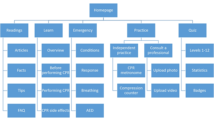
Sitemap
This is a sitemap which mainly describes the information architecture of the contents in the CPR 101 app and responsive websites. It contains information about the pages categories and subcategories as well as its contents. By creating this sitemap, I could plan and organize the content better and in a more structured manner. The main categories I wanted to include in the app are readings (shown on homepage), learn, emergency, practice, and quiz.
Paper Wireframes
Using a pencil and a sketchbook, I sketched drafts of how the mobile ticketing app would look like. I created a few different versions of each page in order to gather every possible layout. In the end, I picked out the elements I liked from each frame, marked using little stars next to it. After analyzing each frame draft and considering which elements I wanted to use, I created a finalized wireframe which included all the starred elements combined.

Digital Wireframes
I transferred the previously created paper wireframes into a digital format using the design tool Figma. I mostly created the designs based on the paper version, but I also made some changes on a few frames in order to improve them.
On the homepage, I arranged four sections: articles, facts, tips, and FAQ. This page is basically a "readings" page, because its contents are mainly texts. The contents here would be regularly updated with current news and developments on medicine.
The main purpose of the app is to help users learn about concepts and techniques of CPR. In the Practice page, users can exercise CPR techniques using guides in the form of videos, metronome, and compression counter. I imagine that the app would be able to count compressions by using the accelerometer inside smartphones, using the same concept as counting steps. I also included a feature to consult a professional, where users can upload photos and videos of their CPR practice.
The Learn page consists of readings on concepts about CPR. I divided its contents into several categories to avoid the page from being too long to scroll, especially on a mobile phone.
The Emergency feature is meant to be used as a guide in medical emergency situations, where people tend to panic and the situation becomes very frantic. I used a large font size in order for the page to be easily readable in a relatively far distance.
In the Quiz page, I created groups of questions in various levels of difficulty. I also included a statistics section and badges users can collect by doing the quizzes.

Usability Study
I conducted a usability study using the low-fidelity prototype I created based on the digital wireframes. In the study, participants were required to complete the task of creating an order using both the desktop website and mobile app versions. I observed the participants' navigation throughout the website and app.
Upon the task completion, I asked the participants about the difficulties or confusion they might have experienced. I also asked about the aspects of the design they liked and dislike, also if there's anything they would like to be changed.
All feedbacks from the usability study were organized into sticky notes in an affinity diagram, which later was used to define insights and create solutions for the next design iterations.
Affinity Diagram
I grouped all of the feedbacks in the form of quotes, recommendations, questions, and statements obtained from participants of the usability studies by similarity to create themes. These groups of themes were used to create insights as a guide to decide what design changes should be made in order to fulfill users needs.

Design Iterations
Changes in the low-fidelity prototype design are made based on insights gathered from feedbacks gained from the previously done usability study. Those changes were implemented in the more improved version of the wireframes, which are mockups. I incorporated colors, typography, and iconography. I also included images for the menu items. I polished the designs by adding rounded corners and shadows for some elements. Some changes regarding the elements and features were also made for a few pages.
In the usability study using low-fidelity prototype, some users felt confused with the context of the contents. I figured that it was caused by using placeholders instead of real texts. In the mockups, I’ve completed the designs with real texts to convey deeper meaning to the designs.
In the usability study, some participants felt that there were too much different sections of the pages, which almost made them seem redundant. In the FAQ page of the wireframes, I included filters for adults, children, and infants for separate contents. In the mockups, I combined the three so that no separate sections are needed, and that a search filter would still be beneficial for users to find certain questions.
Articles Page Before Usability Study

FAQ Page Before Usability Study

Articles Page After Usability Study

FAQ Page After Usability Study

Challenges
One of the most difficult part of the design process is arranging the contents into neat, compact, and visually appealing layout. It's not easy, especially the readings (articles, facts, tips, FAQ) and the Learn page, which consists of different sections and contains a lot of paragraphs. For inspiration, I looked up existing websites and apps with similar contents and try to implement some aspects on my designs, such as how to create menu and headings for sub-categories. I also tried to use the appropriate amount of margins and spacing to create enough white space.
Final Designs
After incorporating design changes on the wireframes based on feedbacks I received from the usability study participants, I finished polishing the mockups and added interactions on all the pages to create a high-fidelity prototype. I mainly focused on the desktop website version, and only created mockups for the mobile app version.
Mobile app mockups

Responsive website mockups
I created two versions of responsive websites: iMac and iPad Pro 11”. For the homepage, instead of creating different sections for the readings, I arranged all of the sub-categories on one screen so that all contents are visible and to make use of the wide space available. I used a three-column layout on the iMac version, and a two-column layout on the iPad version, considering the screen sizes and the amount of content I wanted to place. I resized the fonts and images in order to fit them and changed some shapes for the images. I moved the navigation bar to the header of the iMac and iPad screens, which was previously located at the bottom of the mobile screen, and converted the categories into headings above each content group.

Style guide

Final Thoughts
Takeaways
01
Impact
I designed this product so that people can have a reliable source to learn CPR with comprehensive and detailed information. Participants of the usability study felt that they would use the CPR app if it were implemented in real life. They had a good experience in using the prototype of the app.
02
What I learned
I learned how to design for casual use and emergency use, which is quite different because there are a few things to consider to create effective and efficient designs for both conditions. As I was working on this project, I learned a lot about CPR. Besides designing to help others, I’m also equipping myself with CPR knowledge.
Next Steps
Screen Reader
Arrange heading titles and labels for content to be compatible using screen readers to account for accessibility
Voice input
Enable voice activated navigation in order to be accessible without the need to touch
Chat bot
Include an automated chat bot as an aid for users who have questions and need consultations regarding CPR
That's a wrap!
Thank you for your time and attention upon reviewing this case study, I really appreciate it. Please feel free to reach out to get in touch with me. I hope you have a great day!